Linocut for Beginners: Design, Carve and Print Your First Block
A linocut is a relief print: you carve a block, ink what stands and press paper on it. This guide takes one small practice block from mirrored drawing to first proof, with the hand-safety and ink-safety checks placed right before the steps that need them.
By Lionel Rutledge ·
On this page
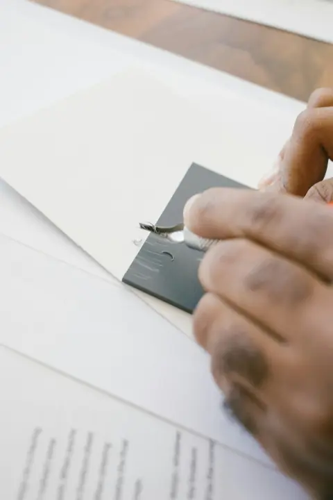
A linocut is a print made from a carved block of lino. You cut away what should stay white, ink what is left standing and press paper onto it. Your first one can be a small practice block printed with the back of a spoon. The one rule that matters before anything else is where your hands go, because lino gouges are sharp.
Tate describes linocut as a relief print made "in a manner similar to a woodcut" but cut into linoleum. The difference from woodcut is practical: lino cuts more easily than wood "and in any direction (as it has no grain)". So if you wonder how hard linocut is, the honest answer is that the carving is the easy part. Thinking in reverse takes longer. The real downsides are small but worth knowing: a cut is hard to take back, stiff lino tires the hand, and every print ends with a clean-up.
This guide walks one practice block, the Four-Square Proof, through every step: drawing, carving, inking, printing and reading the result. Your own picture comes after, on a fresh block.
What goes on the table
You need one block, two cutting tools, something to hold the block still, ink, a roller and paper. Everything else can wait. What to buy, what is optional and what it costs is in the linocut tools guide.
- A soft-cut block, 10 x 10 cm (about 4 x 4 in). Hickman Design, a UK printmaking supplier, says traditional lino "can be quite tough to carve for beginners". It calls soft-cut "significantly easier to carve". Start soft.
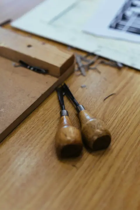
- A V-gouge and a U-gouge. The V is for fine lines and detail, the U for "scooping out larger areas" (Hickman Design).
- A bench hook. Hickman Design says it "anchors the lino sheet to the edge of a workspace", so the block cannot slide while you cut. I would not skip this one.
- Pencil, tracing paper, carbon or graphite transfer paper, low-tack tape.
- Block printing ink, a brayer (a small rubber roller) and a sheet of glass or smooth plastic to roll it on. Read the ink step below before you buy.
- Smooth, light paper and some cheap newsprint for test prints. Hickman Design notes that "smooth papers offer a more detailed image" and that very absorbent paper can blur lines.
- A baren or a wooden spoon to press the paper. A baren is a flat hand pad. The spoon does the same job.
- Soap, water and kitchen paper.
Not yet: a press, a set of ten gouge shapes, a large block. Each of them solves a problem a first 10 cm print does not have.
The practice block: the Four-Square Proof
The Four-Square Proof is an exercise designed for this guide, not a print we made. It splits a 10 x 10 cm block into four squares of about 4 cm with a 1 cm margin. Each square tests one skill, so a single proof tells you what to fix.
Diagram: what you draw on the block, as it should read on the print. Everything you cut away prints white.
Scroll sideways for all 3 columns.
| Left | Right | |
|---|---|---|
| Top | A – Lines. Five straight carved lines that print white; the gaps between them widen to the right. Tests the V-gouge. | B – Curves. One carved S-curve and a small carved circle. Tests turning the block. |
| Bottom | C – Cleared area. Scoop out the whole square but leave a thin rim standing. Tests the U-gouge and inking. | D – Mirror test. A capital F and an arrow pointing right, drawn as they should read on paper. Tests the transfer. |
Step 1: Draw it mirrored and transfer it
The print is a mirror image of the block, so the block must carry your drawing reversed. Hickman Design puts it plainly: "the final print will be a mirror image of your block". The F in square D exists to catch exactly this.
- Draw the four squares on tracing paper. Write the F and the arrow so they read correctly.
- Flip the tracing paper over. The F now looks backwards. That is what the block needs.
- Slide carbon paper between the flipped drawing and the block, or rub graphite on the back of the drawing. Hickman Design's transfer guide gives both methods. Hold the sheet with low-tack tape "to avoid slipping or misalignment".
- Trace firmly. Faint lines are the ones you lose.
- Lift one corner and check. The same guide says to confirm that "no details are missing or incorrectly mirrored". Then go over the lines on the lino with a fine-tipped pen.
- Black out what stays. Hickman suggests you "black out areas that you do not plan to cut". Now the dark parts are the print, and the bare lino is what you carve.
Stop here and check: on the block, the F reads backwards. If it reads correctly, the print will not.
Step 2: Before the first cut, place your hands
Push the gouge away from your body and away from your holding hand, and keep that hand behind the blade. Three sources agree:
- Hickman Design: "Always carve away from yourself."
- Woodworker Specialties, which sells Pfeil cutters: "always carve away from your other hand", with a bench hook to hold the block.
- Adam Cherubini in Popular Woodworking: "Always keep both hands behind the cutting edge of your tool."
Diagram: the block seen from above, you sit at the bottom. Scroll sideways for all 2 columns.
| Zone | What belongs there |
|---|---|
| Ahead of the blade (far side of the block) | Nothing. No fingertips, no thumb. This is where the gouge goes if it slips. |
| The cut | The gouge tip, moving away from you, shallow. |
| Beside and behind the tip | Your holding hand, flat on the block. |
| The edge nearest you | The bench hook, its lip over the table edge, the block pressed against its stop. |
To change direction, turn the block, not your wrist. Hickman Design's tip is to "rotate the lino block rather than your hand" for smoother lines. The East End Arts Council gives the same advice, so the blade never points at your hand. A blunt gouge is a hazard too: "A dull tool requires more force, making it harder to control," says Hickman, who also suggests a first aid kit within reach.
Stop here and check: block against the bench hook, holding hand behind the tip, nothing in front of the blade. If one of these is wrong, put the gouge down and fix it.
Step 3: Carve the four squares
Cut shallow, and go over a line twice rather than once hard. Hickman Design advises "small, shallow incisions" at first and says "a clean channel of 1–2 mm is usually sufficient". The East End Arts Council agrees: "Several shallow passes are usually safer and more precise than one deep cut."
- A, with the V-gouge. Cut the five lines, which are the bare strips you left between the blacked-out areas. It should look like a clean groove, not a torn edge.
- B, with the V-gouge. Turn the block as you follow the S-curve and the circle. It should look smooth, without small steps.
- C, with the U-gouge. Work from the inside out and stop short of the rim. The floor should be flat, with no thin ridge left. A ridge left standing prints as a stray line.
- D. Cut away the lino around the F and the arrow so the letter itself stands.
- Brush off the shavings.
Leave anything you are unsure about. The East End Arts Council warns: "Once an area has been removed, it is difficult to restore." A slip is not a disaster on a practice block. Keep going and see how it prints.
Want to see the carving before any ink touches it? My suggestion: lay thin paper over the block and rub the side of a soft pencil across it. The carved parts stay pale, so a missed area shows up early. The rubbing reads like the block, so a correct F looks backwards on it.
Traditional lino can be stiff. If yours fights back, Hickman Design suggests warming it gently: a hairdryer, a hot-water bottle or "an oven pre-heated to about 50 °C". On soft-cut I would not bother.
Step 4: Choose your ink by its safety sheet, not its label
Read the safety data sheet (SDS) of the exact ink you bought before you open it. An SDS is the maker's document on hazards, first aid and handling for one product. Words like "water-soluble" or "safe wash" on a tube describe how it cleans up, not how safe it is.
Two real sheets show why. Each sheet covers one product only, and makers revise their sheets, so check the date on the one for your ink.
Scroll sideways for all 3 columns.
| Speedball Water-Soluble Block Printing Ink (sheet version 03, issued 19 June 2024) | Cranfield Caligo Safe Wash Relief Ink (sheet version 2.2, issued 26 November 2024) | |
|---|---|---|
| What it is | A water-soluble liquid ink | "Organic and Inorganic Pigment preparations in Linseed Oil" |
| Hazard classification (EU CLP) | "Not classified"; no pictogram, no signal word | "Not Classified"; no pictogram, no signal word. Still notes a cobalt compound "below the cut off value of <0.1%" that "May produce an allergic skin reaction" |
| Ingredients worth knowing | Lists titanium dioxide and crystalline silica, both flagged for inhalation. The sheet says a liquid ink is not likely to release airborne particles | Also warns that repeated exposure may cause skin dryness or cracking |
| On skin | "No specific first aid measures are required." If irritation occurs, wash with soap and water | Wash with soap and water or a skin cleaner. "Do NOT use solvents or thinners." |
| Gloves | "If contact with the material may occur, wear chemically protective gloves." Wash hands after handling | Gloves "for prolonged or repeated use or for individuals with high skin sensitivity"; safety glasses against splashes |
| Fire | Flash point not available | Flash point above 100 °C, fire risk rated low |
Neither ink is classified as hazardous. Yet both sheets ask for gloves in some situations, and the "Safe Wash" sheet still flags a trace of a cobalt compound that may cause an allergic skin reaction. Sheets also change: the January 2015 edition of the same Cranfield sheet classified the ink as a skin sensitiser (H317), the 2024 edition does not. Neither product name would have told you any of that. These are two products, not two categories, so do not read the table as "water good, oil bad".
My suggestion for a first block: a water-based ink, because it cleans up with soap and water and needs no solvent. Hickman Design's equipment guide names the trade-off. "Water-based inks are easier to clean up, while oil-based inks provide a richer color but require solvents for cleanup." Wear gloves, keep soap and water nearby, and keep food and drink off the table. The University of Vermont printmaking safety page says to wash your hands before eating or drinking.
If you use an oil-based ink, deal with the rags. The University of Vermont warns that "rags or paper towels contaminated or soaked in linseed oil may ignite by spontaneous combustion". Its fix: self-closing disposal cans taken out of the room each day, or a pail of water. The Cranfield sheet does not mention rags, but its ink is pigment in linseed oil, so I would treat its kitchen paper the same way. Both university pages, including Kent State, say not to clean ink off your hands with solvents. Both suggest baby oil instead.
Step 5: Ink the block and pull a proof
Roll the ink thin. Hickman Design's process guide says "a pea-sized amount is a good start" and to roll it on the glass until you see "a velvety texture". Its troubleshooting page adds a better test: roll until the ink "feels slightly tacky, rather than globby".
- Roll the ink out on the glass. It should look like thin velvet, not a shiny puddle.
- Roll the brayer across the block in a few directions. Only the raised parts should take ink.
- Lay a sheet of newsprint on the block. Set it down gently, "ensuring no creases or bubbles form" (Hickman Design). If the block slides, put a non-slip mat or double-sided tape under it.
- Press with the spoon or baren in small circles over the whole back of the sheet, firmly and evenly.
- Peel from one corner, slowly, holding the block down. If a patch looks pale, lay the paper back and rub that spot again.
Keep a damp cloth nearby for inky fingers, as Hickman's workspace guide suggests. A thumbprint in the margin is the classic first-print souvenir.
Dry or damp paper? Start dry. Hickman Design lists dampening as a fix if problems persist: soak the paper briefly and press it between newspaper until just damp. Writing about Japanese papers, Washi Arts notes that "many papers print well without dampening, especially gampi".
Print two or three proofs on newsprint before any good paper. Hickman Design recommends "a quick proof print to catch any problems early".
Read your proof square by square
Lay the proof next to the diagram and check each square. The causes below are the likely ones, not the only ones, so change one thing and pull another proof.
Scroll sideways for all 4 columns.
| Square | What you want to see | What you see instead | Likely cause, then fix |
|---|---|---|---|
| A – Lines | Crisp white lines, gaps clearly widening | Lines fill with ink, edges blur | Too much ink. Hickman lists "filled-in carved lines or loss of definition" as a sign of over-inking. Roll thinner; deepen a line only if it is very shallow |
| B – Curves | Smooth curves | Small steps or ragged bends | The wrist turned instead of the block. Re-cut lightly, turning the block |
| C – Cleared area | Clean white square inside a printed rim | Grey dots or streaks in the white | Ink reached the floor, or a ridge was left. Roll thinner, then shave the ridge |
| D – Mirror test | F and arrow read correctly | F is backwards | The drawing was not flipped before transfer. Cannot be fixed on this block; note it for the next one |
| Whole print | Even black | Pale or white patches | Too little ink or pressure. Hickman suggests more of both |
| Whole print | One sharp image | Double edges | The block moved. Hickman suggests a non-slip mat or double-sided tape under it |
If A, B and C pass and only D fails, your carving is fine. You learned the mirror rule on a practice block, not on a finished picture.
Clean up and let it dry
Clean the slab, brayer and block straight away. For water-based ink, Hickman Design's cleaning guide says "warm soapy water often suffices". Do not soak the block, which can make lino "warp or swell", and blot it dry with a clean cloth. Oil-based ink needs white spirit or a lino cleaner, the same guide says. A "safe wash" oil ink is the exception: for spills, the Cranfield sheet says to "clean up preferably with a detergent; avoid the use of solvents". Follow the maker's cleaning instructions. Never pour solvent down the sink, and open a window: the University of Vermont's advice for solvents is to "use adequate ventilation".
Lay the prints flat somewhere safe. Drying time "can take anywhere from a few hours to a few days", depending on ink and paper, according to Hickman Design. Keep the practice block. It is your reference for the next one.
Next: one small block of your own
Take a fresh 10 x 10 cm block and one bold picture: a leaf, a cup, a house. Hickman Design recommends a design "that can be effectively executed in a single colour" with clear light and dark areas. Ask first which parts should be white, because those are the parts you carve. Working from a photo? Trace its main shapes onto tracing paper and fill each one in as either black or white, no greys. Hickman Design suggests tracing paper for refining a design, and a two-value drawing is what a single-colour block can print.
Run the same five steps, and change one thing per proof: only the ink, or only the pressure, or only the paper. A carved block can be inked again and again, as the East End Arts Council notes, so a small run of cards costs little more than paper and ink.
How many prints will one block give? None of the guides I read puts a number on it, so I won't invent one. They do say what wears a block down.
Traditional lino ages: Handprinted, a UK supplier, says old lino "will dry out and become crumbly", while soft-cut "does not crumble" (Handprinted). Art Beat Box warns that grey traditional lino "can become brittle when exposed to extreme temperatures" (Art Beat Box). Soaking the block when you clean it can make it "warp or swell", as Hickman Design notes. So keep blocks flat, dry and away from heat.
If you want the print to end up on something you use, the functional art guide shows simple routes from a print to a useful object.
Spotted a claim that looks wrong? Tell us on the contact page and we will check it against the source.